coloradodisabilitylaw.com
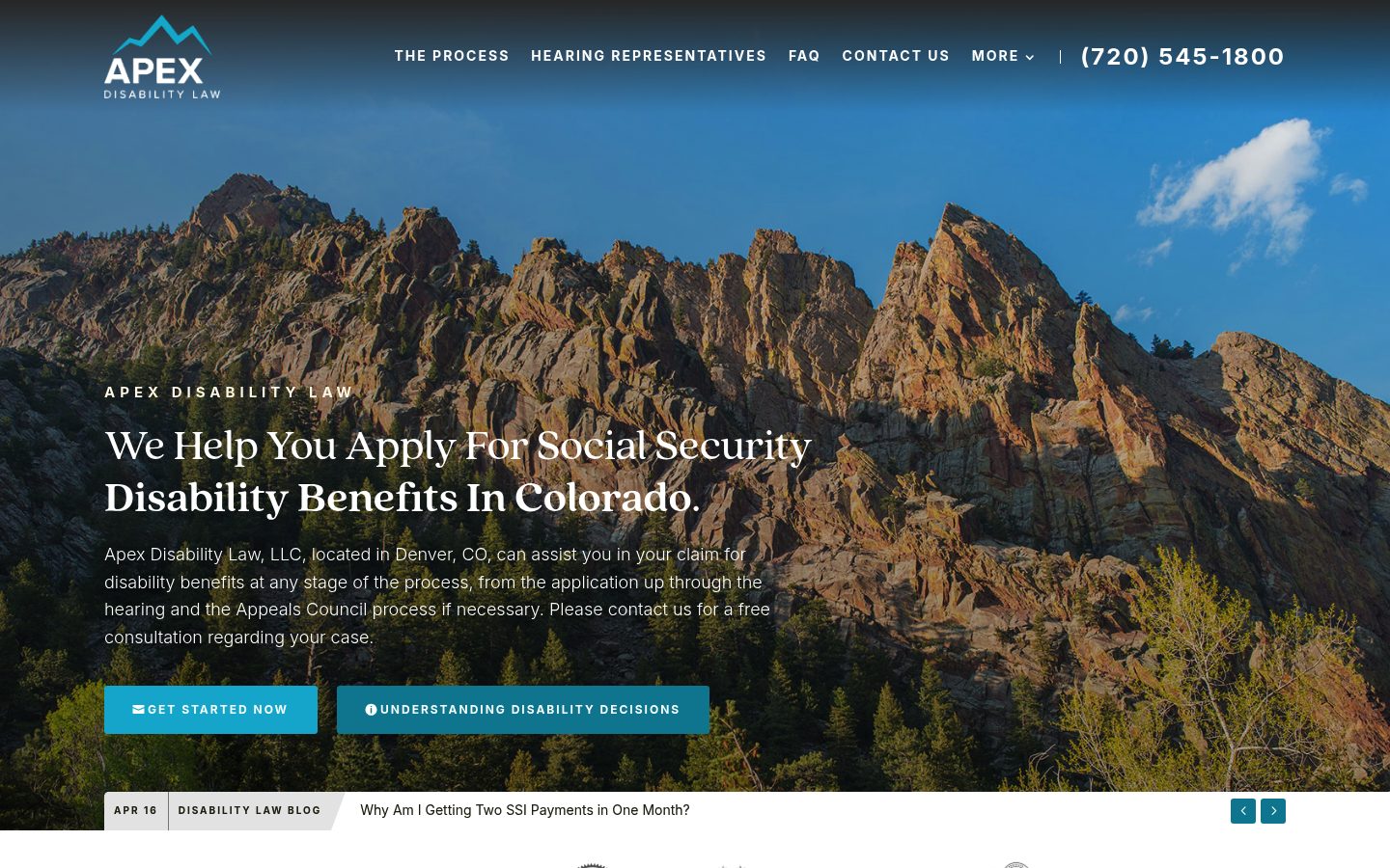
When someone is stressed, moving fast, and scanning similar promises across open tabs, sameness does not feel neutral. It makes the decision harder.
Scroll to read the reportThese screenshots come from different Colorado law firms. Side by side, the repeated colors, hero images, calls to action, and page structures become easy to see. The point is not to call out any single firm. It is to show how similar the category can feel to a prospective client.
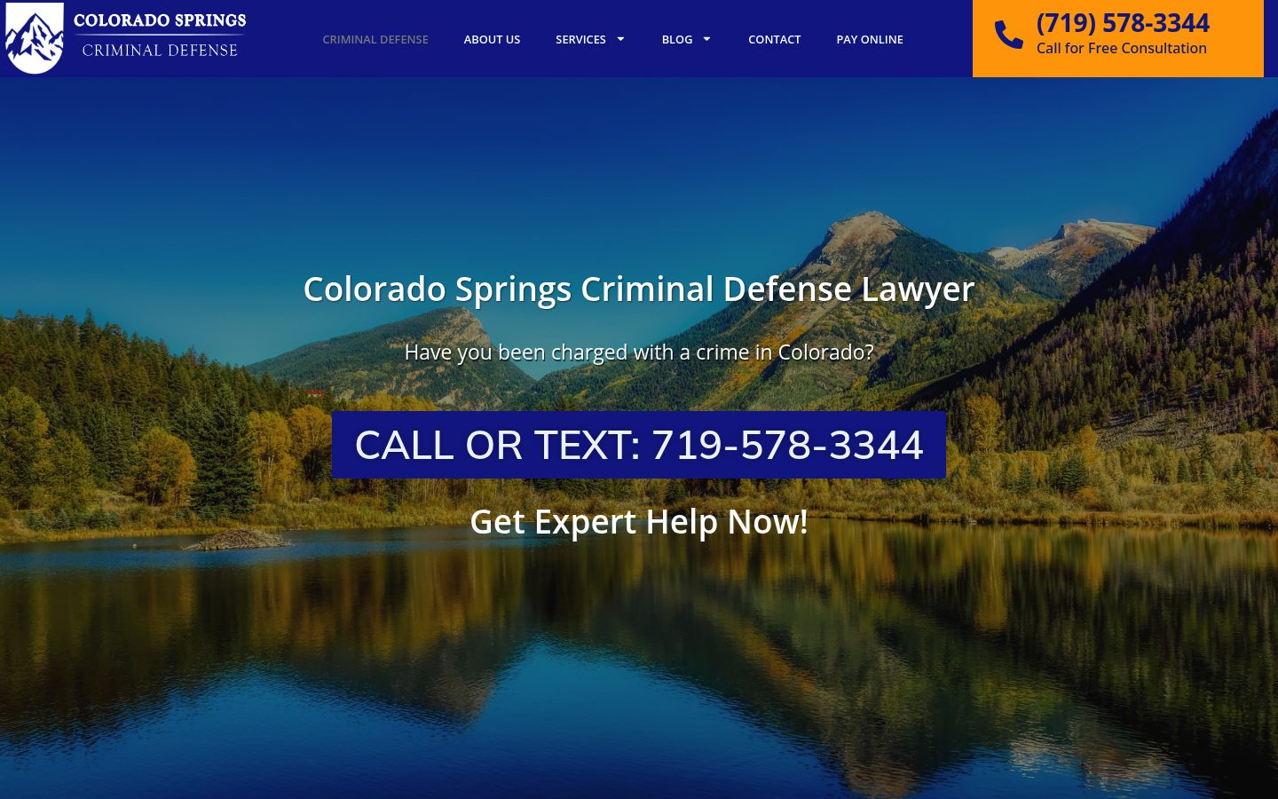
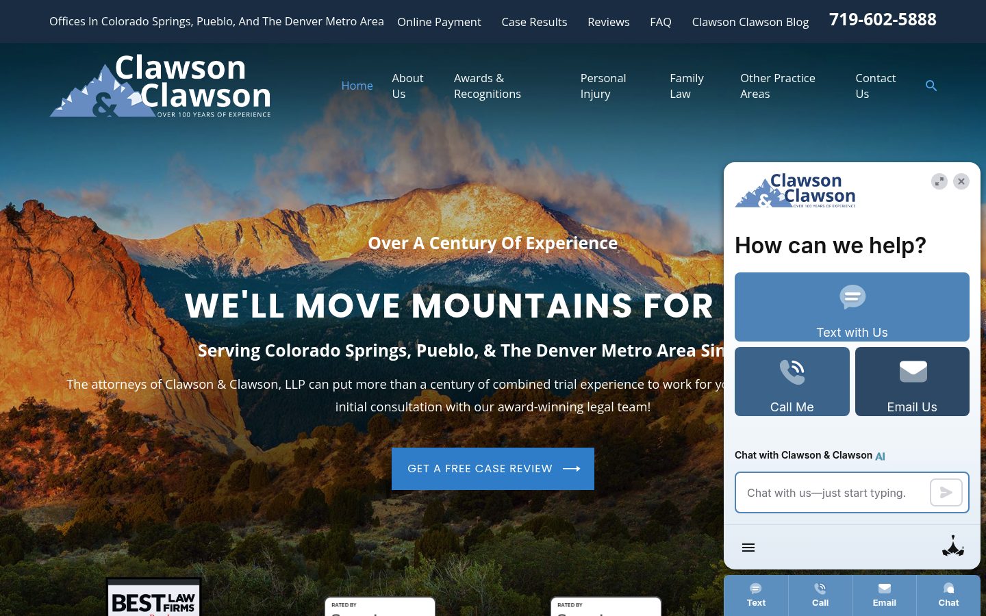
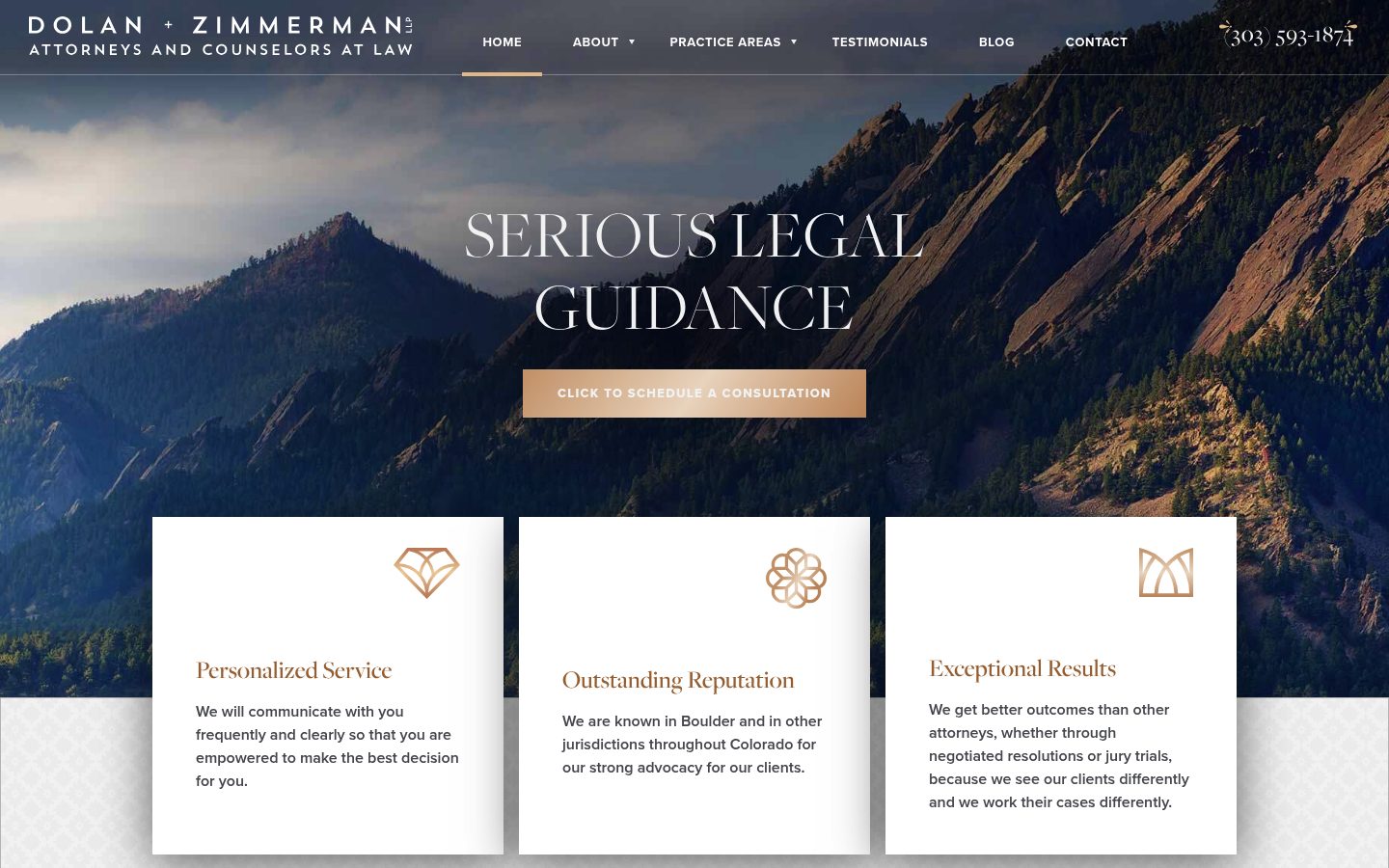
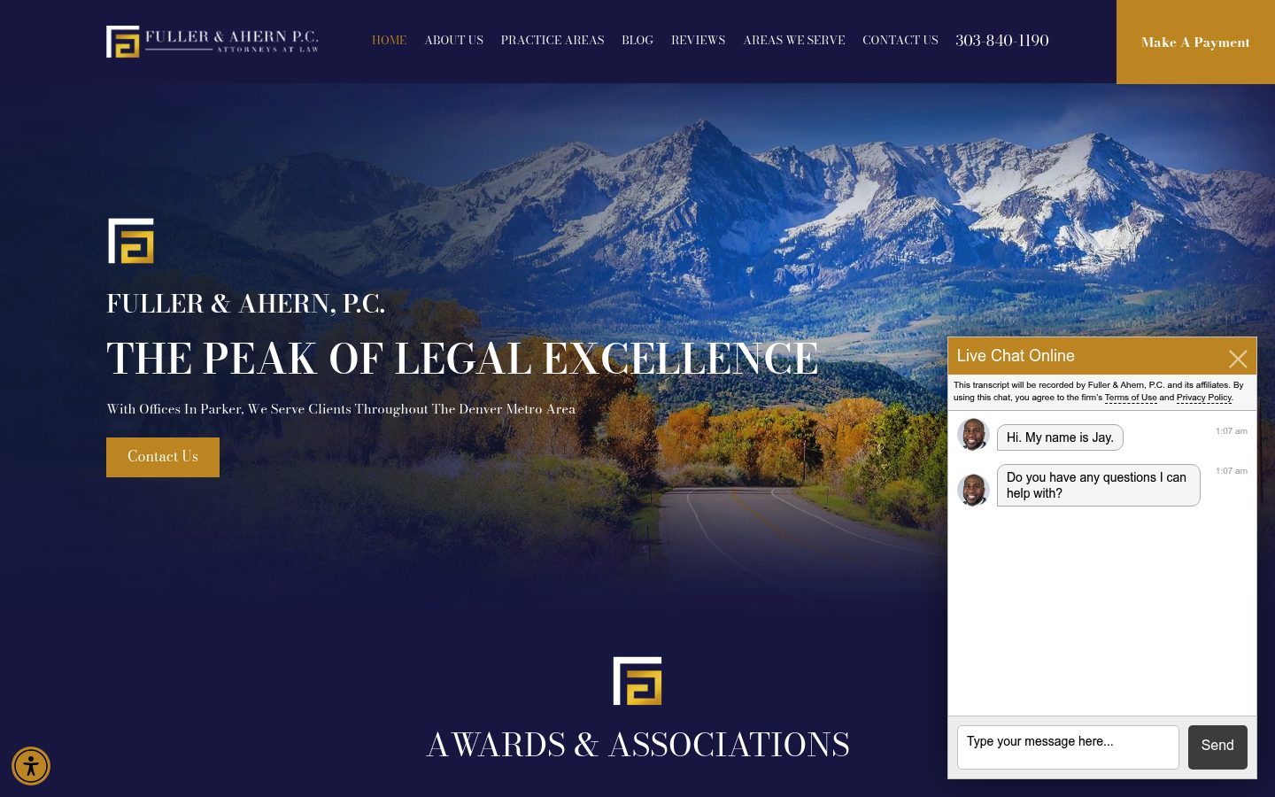
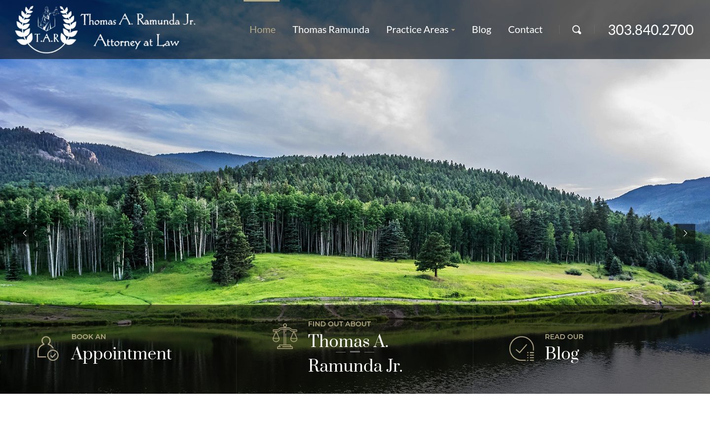
Blue is not the problem. The issue is what happens when color, language, layout, imagery, and positioning all begin to overlap.
Blue can be a smart, credible choice. But when nearly half the category leans on the same visual language, it puts more pressure on everything else to be distinct.
Contrast, voice, symbols, structure, and unexpected combinations can all help a firm become easier to notice, easier to recall, and harder to confuse with everyone else.
The mountain is an easy regional shorthand. The issue is not that the symbol is wrong. It is that a familiar cue stops feeling ownable when too many firms reach for the same signal.
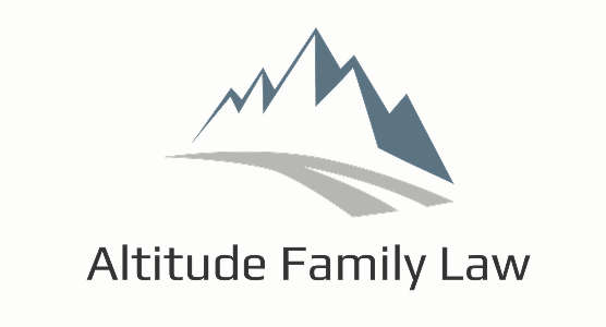
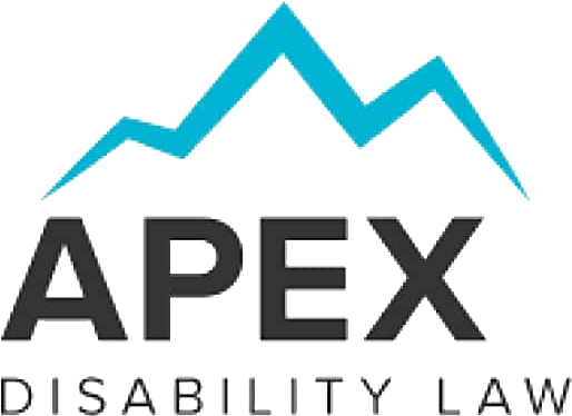




Scales, shields, columns, and other legal symbols can communicate the category quickly. They also make it harder for a firm to be remembered as a specific choice instead of another credible option.








Search visibility is becoming less purely human. Firms need technical signals that help agents understand who they serve, what they do, and when they should be recommended.
Many firms explain themselves to people, but not yet clearly enough to machines.
Most firms are not yet giving AI crawlers an explicit technical read on what to access, summarize, or prioritize.
Many sites still rely on page copy alone instead of richer schema, entity, and service signals that machines can parse cleanly.
The strategic difference between firms is often visible to a human only after careful reading, which is not enough for agent-mediated discovery.
A law firm often shows up as a browser tab, search result, referral text, social avatar, or saved contact. If the mark is too complex to read there, the brand has to be remembered the hard way.




We are a creative agency focused on reducing the risk that serious firms look interchangeable. Our branding and web work has been recognized by Lawyerist, The Brand Identity, and the clients who hire us to make choice feel clearer.
One clear, actionable move for your website or brand. At no cost, with no pitch required.

At the end of the day, having a great brand and website is all about mitigating risk. There are a lot of ways we can help. This is simply a useful place to start.
Hire you, not follow you.